Saturday, May 31, 2008

Things are abound to happen


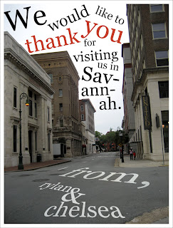
Now every once and a while we get people that either visit us or do something for us that is well out of our ordinary routine. For these such occasions we try and come up with a little thank you. So I suppose this is the result of what happens when someone visits us (hint hint Taylor and Andrea)! A couple days ago we had the pleasure of having Chelsea's dad's cousin come into town. It was great to have them here as we hadn't seen anyone in a while and well they were a blast to visit with. They took us out to dinner at Tubby's on River street. We left the house around seven and figured we would get home around ten or so. Well we ended up visiting with them until about midnight. We were just hanging out on a nice cool night in the restaurant. It was a day in between my finals so I didn't have much to worry about. It was such a delight to have them here. So we made a little thank you card. This isn't the first one I've made. I made a charcoal sketch of Mickey Mouse for Nicki and Jim (Avid Disney fans - and btw the sketch was awesome!). They are basically like second parents to us out here, and they never had to be. I also made a thank you card for just hanging out with Blaine and Ginger - at a time when we definitely needed a friend to hang out with. The thing that is different about this one is Chelsea and I both made it. A little burned out from work I devised a plan to get Chelsea to do her favorite thing...become a tourist in her own town. I handed her the camera and told her to take pictures of everything she wanted...and from there I would make something with it. This got us out of the house on a Friday afternoon and we just walked around downtown (a wonderful sight to see I must say). You can just meander and not have a care in the world. This is a picture down Drayton street I believe, and when I saw it I just immediately imagined text filling in that bright white sky. Really, with the architecture in Savannah, you don't have to do much with it. I dig it.

On a side note, in the post earlier this evening about cafepress, I found a better website. So the shirts are there now too and you can select what type of shirt you want it on. You can also select different colors, its pretty awesome. so check it out! Rylan's Zazzle Page Oh and make sure to promote the hell out of me :) thanks

Design Solution: Lloyd

So thought I would throw down another quote shirt for the hell of it. This time it's from 'Say Anything...' Unfortunately, I didn't know this but on a basic account for Cafepress you can only have one of each type of product, so I couldn't put this on a V-neck. I am kind of disappointed by this realization, but such is life. The upgraded account is like six dollars a month...something I don't really feel like paying for especially if I know that the products aren't going to be sold that much. I wish they worked a little like deviantart in which you paid a one time fee for your prints account. They are still getting money from their cut of the print. Maybe if people digg em I can put like a different one up each month, I dunno. I suppose I digress a little. The shirt font is meant to look like the new logo design for the movie...I wasn't to keen on using the old one as it was a cheesy script font. The pen is actually two different pens put together through scanning and Photoshop. The ink was made from me printing out the text and then actually going in and scribbling on the paper. Scanned and changed the color to blue (it was black) and then put it all together for the finished piece...easy as pie. Check it out, tank top, at Cafepress!

Friday, May 30, 2008

Design Solution: A Beginning of Something

I have long been expressing interest in the idea of my own t-shirt design company. Now the following has nothing really to do with anything about realizing that dream. This is more about making something else entirely. I have had this idea for a website, in which I will probably not get into the entire details of the idea as I don't want to give it away and hell you never know, I might actually make it someday. But let's just say the idea centered around that of chick flicks. It is kind of an interesting place for me, as a guy, to find myself thinking about. But alas, I have, thus a couple things have resulted from it. I had this idea of T-shirts that comprised basically of simple images and quotes from movies. Every good movie has the perfect quote that gets repeated around water holes across the globe - "You breed raptors here?" - "This is Sparta!" - "Let's Call it Steve!" - "I gave him a break." - "Here we are, Sunset and Camden!" - "Goonies never say die." - "My name is Maximus Decimus Meridius, commander of the Armies of the North, General of the Felix Legions, loyal servant to the true emperor, Marcus Aurelius. Father to a murdered son, husband to a murdered wife. And I will have my vengeance, in this life or the next!" - etc. Some people may not know what all of those are from, but you get the picture. My idea is not exactly unique as their are tons of shirts out there like this, I am but one of many. Since they are kind of spare time kind of things, I am using Cafepress as the people to print them. It makes them a little more expensive, but I don't have to worry about inventory or anything like that. These are kind of extra things for fun, and you'll probably see a few more on here. This one is from the Notebook, and a great line from the movie, "If you're a bird, I'm a bird." It is a line that Chelsea absolutely loves and well goes with the whole chick flick thing mentioned above. As for creation of the piece...the birds were hand drawn using pencil, just a quick sketch. Then they were inked and scanned in. I fixed up the lines just a bit, moved some stuff around to make them work together. I only drew one bird and dup'd it for the other. The color was added in photoshop - sort of going for a watercolor look. the overall feel was to be quaint and simple. So the birds are sort of sketchy and the type was to be a bit elegant - definitely a serif font. I messed with all the font fixings to make it flow together until I got a bit of something I liked (that sentence was awesome). Well go check it out over at Cafepress! If you love it and just have to have it, you can buy it too (hawking my designs for a couple extra bucks, lol)! Really though its just something to do for Chelsea and for fun. Thanks

Tuesday, May 27, 2008

tonight, we dine in... our kitchen!

so for those of you who know rylan and i, you know we don't cook. or bake. or spend much time in a kitchen. but god knows we can eat like world class champions. well i'm proud to tell you that tonight, we baked. in true southern tradition, we made paula deen's key lime pie with meringue on top. let me start at the beginnin' fo' y'all...

we were looking through our cookbooks (yes, i know. it doesnt make sense why two people who don't cook have cookbooks, but they look good sitting on the shelf in the kitchen!) trying to find something to cook for dinner. it's usually useless for us to do this, and just makes us crave something from a restaurant... well we still didn't find anything for dinner BUT one of my coworkers had been talking about some icing or cake frosting thing all day, so i started looking through the dessert sections. rylan's not a big fan of key lime pie, but i loooove it. well for whatever reason he thought he might like it if i made it (i know, right? how sweet. i guess...) after one trip to publix and several phone calls to my mom (domestic goddess) we felt comfortable in our decision to attempt the impossible.


ok, long story short, i baked the pie. we had to remake the meringue, cause that was freaking hard, but i opened up the oven door, and im not too humble to admit that marie calendar herself couldn't have made a more beautiful pie! and did i mention that it was edible?! cause it's so good and im excited for breakfast (or perhaps a late night snack).

i can now officially make four things:
1. macaroni and cheese (yes, from a blue box)
2. cupcakes (funfetti)
3. peppermint bark
4. key lime pie

paying the bills doesn't make me a real adult, but apparently baking pie does...

Friday, May 16, 2008

i just have to take a moment away from all the design chat to say how excited i am about california's decision to overturn the ban on same sex marriage! it disgusts me to think that people believe it is okay to take away a person's right to marry based on their sexual preference. this is such a step in the right direction! yay california! two states down, only 48 more to go!

I believe that someday we’ll look back on this and not allowing gays to marry will seem as absurd as not allowing women to vote.- Ellen DeGeneres

ok rylan. im done now (getting off my soap box)... go back to your design talk...

p.s. if anyone knows a good way to get rid of roaches, we need to talk asap.

Thursday, May 15, 2008

Design Concept/Solution: Brain Noodles Site

So for the past month or so I've been working quite diligently on a freelance project for Brain Noodles LLC. I designed their original site about a year ago with the focus of the site to just create a little buzz about Brain Noodles. It had nothing to do with a shopping cart or building this content-rich site. It was almost like an ad for this new craft product. Well fast forward one year and I find myself basically redoing the site. This was an exciting opportunity because while since doing the site a year ago I have learned a lot and I feel I have improved. I do say though, that between school, catering, freelancing, and art director at A5, my life has been rather hectic (Thank you Chelsea for your patience that is probably tested everyday). But I really do feel this as a great and exciting project. As the designer for the site I am trying my hardest to make sure that this site gets exposure as much as possible. I really want it to grow, as success for them, is success for me. A lot of my spare time has been research for this site and just trying to improve whatever I can. So I hope a little inkling of that determination shows through in this rather quirky site. So I guess let me get to the actual design stuff of the site.
The first design of the site consisted of a flash page that told a little bit about what Brain Noodles were, some suggestions on what to do, etc. - nothing too serious. About a month ago, I was contacted with some changes to the site and after some discussion we put into motion a change from the flash page to a HTML based site. This was to conform better to the search engines and also make visitor navigation easier. So the visitor navigation was changed to the one seen today on the left side of the screen. I tried to keep the mood light and fun - a theme carried over from the old design. The front page was to feature just a few important things on the site..including things you can make with Brain Noodles, store locator and their new products. From there we went through creating a teachers page, rebuilding the shopping page to use more of a inventory based system. An arts and crafts page (still sort of working on this as I'm writing this). A store locator for all the places you can find Brain Noodles. Plus creating countless graphics and changes to copy. I feel the site is starting to become 'beefed up.' I'm hoping this is only the beginning. While I'm slowly improving the site, I'm hoping the idea will really take off so we can get some user interaction. The main focus I want to build is what you can do with the noodles - and my goal is to get customers to show us. These are the ones with the creativity and the ideas. Painters use paint, I use the computer - someone out there is bound to use Brain Noodles. well thats all I got, be a pal and take a minute and check out the site, tell some friends that might like this sort of thing, Hell I don't even do crafts and I am excited about it! Anyways without further delay...the site: http://www.brainnoodle.net

Wednesday, May 14, 2008

Design Solution: SCAD Fashion Show Food Cone

At Indulge, we have the opportunity to cater the big fashion show this year at SCAD. This is a big event for around three hundred people and we want to stand out in everything we do. One of the plans is to serve one of the offered foods in a cone, so people can carry it around easily. We have done this before for other events, and while the cone seems strange at first, it works pretty well. For the Fashion show, I was put in charge of designing a unique cone that complemented the show.
Immediately I was brought back to my design-one class over at Pima and a project we had to do in which we found real objects and then cut them out to create a color wheel. I just happened to do my project using only fashion objects. The original project turned out quite well and I think is actually Chelsea's favorite piece that I have done (she has the original). The cone having a round shape would be a perfect application to implement this previous project. And therefore I began converting my previous design into a new design. A few changes happened while designing the cone. Being a smaller space I had to cramp the colors together more and I decided to make the girl more pronounced (actually the girl was not part of the original project due to assignment constraints, but I always had her in the photoshop file). I added a gray border on the top and bottom to balance the piece. Before, I felt the color circles were just floating off the page. These borders anchor them in their own confined space. It also allowed me to put SCAD and a beautiful quote from Mark Twain on there. Its great being able to ride the coat-tails of genius. Overall, I think the finished product is a pretty attractive cone. While it is probably the smallest part of the event, I suppose if one person takes notice, I've done my job.

Thursday, May 1, 2008

Design Solution: PATHS Splash Page

PATHS is a client we have for A5 and this project is actually a carry-over from the older A5 group...Since I joined, the agency has basically flipped staff with all new people. This is the one project that was left-over from them. Since it was a project already in progress, most of the look and theme for this ad campaign was already set. Just a little back ground, PATHS is an organization that promotes Teen Pregnancy Awareness and Education. One of the goals for this project is not to cast negative emotions toward teen pregnancy, but more so to make kids think before they choose. My job on this project has been to create a splash page for their website. Now most, if not all of the art was created by other people within A5, and I am not taking credit for it or the photography - we have some pretty good photographers I would say.

My goal was to make a site that relayed the same information that we have presented in billboard and poster form.

Stay within the style and theme that had already been created

Create a page that resizes and fits to anyone's monitor for better viewing

Easy addition, re-organization, and deletion of images.

So I created a flash page that basically is two frames...The first one sets up the variables and actually has no images on it. The second one contains the striped background, the content and the white bar at the bottom. Each transition is the same stripes that are then tinted using action script. By adding another movieclip you can easily add another scene to the rotation. When the movie first loads, it checks the size of the window and sizes everything in the movie accordingly. Each scene has its own variables that allow it to tint the lines and background, as well as change its size and position. I would say it works quite well. Anyways, I hope everyone likes the splash page. It was interesting to work with such a different theme. I mean most of my experience has been with package design, toys, etc. This was definitely more advertising based and it was cool to have a change of pace.


PATHS Splash Page